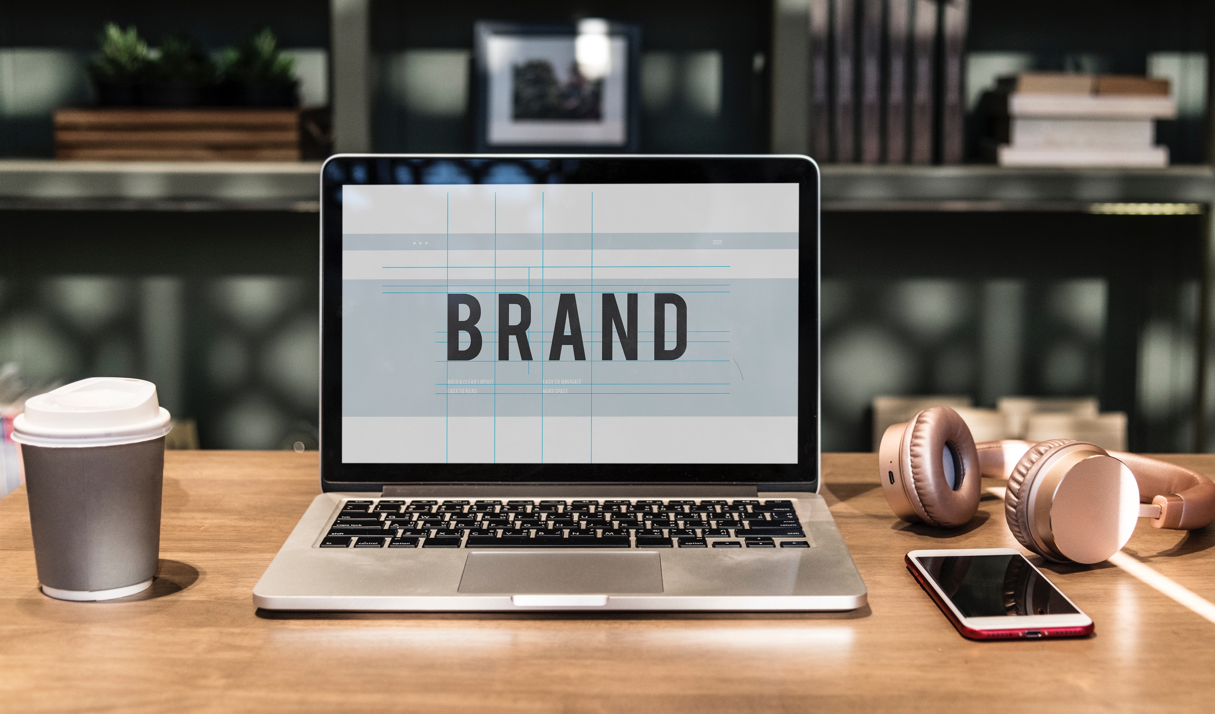
A logo is basically your business’ very first contact with the outside world. It enables people to have a first impression which could lead to the likelihood of them opening up to your products/services. Any designer can make you a logo which will fit for all-purpose solving your need for the meantime. However, as a centerpiece of your branding schemes, you must make something that stands out in the market of bland, crappy, and generic types of Logo.

With a blend of designing skills and skillful applications of the creative theory, you can make your desired Logo. A practical design enhances the properties of the Logo and reflects the company itself in it. Experiments show that about 79 % of the general public first view the company logo before reading its name. A standout logo will give you all the advantage to make your business shine and prosper. Here are some tips on how to make your Logo powerful and compelling
1. Know the Brand
Don’t just give the name of your company and make the designers pop out a logo for you. Make the artist reflect the brand in the Logo and to successfully attain that give him/her the complete information about the company. Knowing the brand will enable you to reach a specific set of people through the Logo alone. This set will filter out most of your clients and customers, which will yield your targetted company performance. So, understanding business, brand, and the market; will give you a brand ideology is and what inspirations it might hold for the future. Search these components in your Logo as the first thing.
2. Impression is crucial
Your logo design must be the one which makes a lasting impression to any viewers. Studies have shown that people tend to remember 3 times more if a logo or picture is shown to them alongside the words. Without any doubt that the market is full of brands and product, make sure that any pe[prson gazing into yours will remember for some time in future. With an excellent mesmerizing design, the company attracts the customers any time in the future, when the topics pop up.
3. Make the color combinations work
A critical factor in making your Logo stand out from the rest is the combinations of colors that one uses to complete the Logo. You might not give enough time for the color step, but certain psychological factors must be considered here too. The primary color in your Logo might send the message of your brand being Passionate, aggressive, energetic, or simply other negative/positive ones.
For example, the use of blue color mostly succeeds in attracting young customers. Similarly, orange colors are mostly preferred by kids of growing age in the supplements they want as toys. Select the prime color to go in the Logo as well as the other places it might be. Other components in the Logo mustn’t overpower the primary color. For distinctive purposes, you can select a quarter of your Logo of unmatched colors rather than scattering it in the Logo. So, use colors which evokes the right emotion field of your consumers.
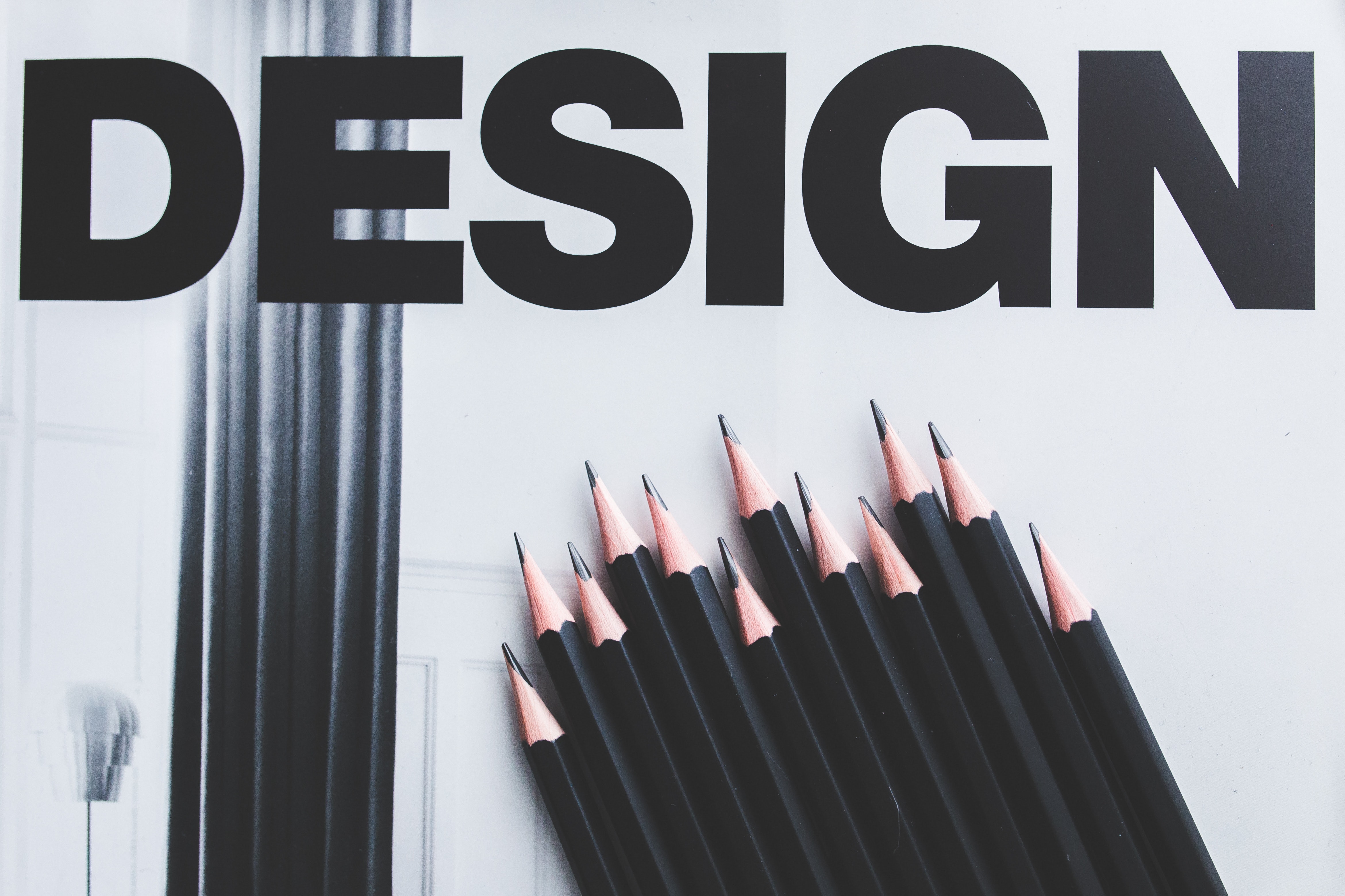
4. Make the best use of the Fonts (Don’t overdo it)

Many designers out there select the font that is used in the Logo randomly. One must not forget that these typefaces speak about the personality of your brand. Too regular, and it tends to be bland and too mingled can make it straight irrational. For example, if you operate a business for children technology, you might use handwritten fonts for the purpose. The aim of this is to make the parents understand that your business is ‘Child-Friendly.’ A font might describe your whole business sometimes as we can learn from Facebook using “f” from the Klavika Bold font. Also, you must avoid the gimmicky fonts and try some unique ones here. For example, the iconic ‘Coca Cola’ font, which flourished from its iconic smooth flowing style.
5. Choose the Logotype
A logotype represents the actual component that you want to raise the advertisement level of your company. The most common types are those that use the original name as the main feature. For example, coca-cola, RayVan, IBM, and so on. The key advantage here is being able to advertise your brand name and people being able to identify it straight from the name. This benefits startup and also the business of less marketing budgets.
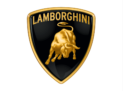
On the other hand, if you are looking for a symbol to represent your company, you must give a good time for the main component. However, the result might be better than that of the brand name using as people tend to remember the graphical features more. For example Penguins for Linux, the letter ‘M’ in Mcdonalds, the bitten apple of Applpe Inc and so on. The next type of Logo is a hybrid of the above two. Using both name and Logo might be an option too, but one must make them clear enough, and the components must complement each other. For example, the bull and brand name in Lamborghini, The name and colored window of Microsoft, or that one of Pepsi. Choose wisely and work in it as this step is a crucial one.
6. Make it Scalable
The most common mistakes that make an unattractive logo is using a lot of components in it. Well, more information certainly means a lot of good things but don’t forget the variety of places in which you will use the Logo. Difficulty in reading or viewing the components in your Logo might just pull the attraction away from it and in worst cases could misinterpret the message of the company. Your Logo must be clean and suitable for the standard size as well as for big banners and small badges or icons. If there is too much congestion in the components, you might even consider losing some while you make these in small scale. Similarly, the more and uneven spacing might make your Logo unmanaged in big banners.
Something as simple as a logo might need your serious time and concern. For more help in any component or website design, analysis, and enhancement tips, contact us.